

In today’s competitive climate, wayfinding in healthcare goes beyond functional necessity; it serves as a prime opportunity to differentiate and make a brand statement.
An effective wayfinding system boosts trust, loyalty, and satisfaction as patient experience assumes numero uno status on healthcare’s priority list. This patient-centric push has led an increasing number of health systems to invest in custom branded programs for wayfinding in healthcare.
Seattle Children’s Hospital and Texas Children’s Hospital are at the forefront of wayfinding innovation. Both hospitals have received numerous awards for their programs, so we decided to reach out to learn more about their success.
Our conversations revealed seven key fundamentals when it comes to planning and designing a top-notch program for wayfinding in healthcare...
 |
| Children's Hospital after the wayfinding redesign. |
#1: Reflect Your Brand.
With increasing healthcare options, from 24/7 urgent care centers to retail clinics, a strong brand identity is now the rule rather than the exception. Wayfinding in healthcare provides an ideal platform to visually communicate your organization’s values and mission to connect with patients on a deeper level.
Seattle Children's: To ensure that the brand was truly reinforced, a multidisciplinary team collaborated on the look, feel, and style. By bringing together facilities, marketing, communications, and the designers, SC Architects, the team was able to gain a diverse and well-rounded scope of the true brand identity, said Todd Johnson, Vice President of Facilities.
Texas Children’s: Texas Children’s worked with Houston-based design office Formation to develop a research-led wayfinding system that would honor the hospital’s brand while also addressing the unique challenges of navigating within the Texas Medical Center. “Texas Children’s brand projects the highest level of care and professionalism in all areas, including wayfinding. We approach wayfinding initiatives with the mantra ‘child-friendly, but not childlike’. Our system is a balance between highlighting our pediatric roots and showcasing our reputation as a leading health care organization,” said Elisa Lange, senior brand marketing specialist.
Bottom line: Your hospital’s brand is your greatest asset and stays top-of-mind for patients when integrated into design elements in a consistent, seamless fashion.
#2: Re-think Tradition & Tell a Story.
SC: In the past, Seattle Children’s was split into seven different zones and each was assigned an “identity” that had no meaning or relationship (a train, giraffe, etc.). This time around, the team decided to lessen confusion by reducing seven zones to four. They also created a meaningful relationship between the zones, based on the geography of the Pacific Northwest: Forest, River, Mountain, and Ocean.
When interviewing different artists, Johnson was impressed by those who incorporated a narrative into the illustrations, demonstrating empathy for the situation families and patients are facing. For each zone, they added animals that would be found within them: rabbits for the forest, salmon for the river, and so on. They also re-named each elevator to align the zones.
 |
|
Prototypes for Seattle Children's "Ocean" zone |
#3: Truly Enhance the Patient Experience.
Wayfinding in healthcare done right does more than just direct patients from point A to B: it’s a pillar of a great patient experience, turning what can be a frustrating ordeal into a smooth, engaging journey. A more unified experience between all the moving parts (tech, the built environment, staff) is critical to alleviating stress and maximizing efficiency.
SC: Seattle Children’s set out to make their wayfinding about “more than just functionality,” with the recognition that many patients will spend their entire pediatric experience within the building. The team’s goal was to put these young patients at ease in a potentially scary, unfamiliar setting, and empower them to navigate on their own without needing language.
This approach resulted in a design that’s fun, inviting, and colorful, so kids could create games, stories, and find positive distractions. In each zone, “animals present themselves whimsically and turn up in different places--and hoofprints are everywhere,” Johnson said.
Positive distractions aren’t just a necessity for pediatric patients, however. Incorporating these into healthcare environments for all ages elevates the patient experience.
 |
|
Children's Hospital River Zone |
TC: Don’t forget about the living, breathing ambassadors for your hospital’s brand: At Texas Children’s, employees are viewed as the biggest wayfinding resource of all.
“We need everyone engaged in this process in order for it to truly be effective,” said Jill Pearsall, assistant vice president, Facilities Planning & Development. “We want to make our patient experience as seamless and compassionate as possible. The changes that are being made also arm our employees--our biggest wayfinding aids--with a better knowledge of our locations, empowering them to help patients and families find their way so they can focus on what is most important--their medical care.”
Formation’s wayfinding strategy for Texas Children’s embraced a multimedia approach, acknowledging that each visitor is different and finds different wayfinding methods helpful. Coordinated elements of this strategy include:
- building color assignments
- building level guides to show how different facilities connect
- exterior signage visible from street-level at major entrances
- wall signage
- a wayfinding-specific website
- printed maps and directions
- updating electronic patient communications with wayfinding details
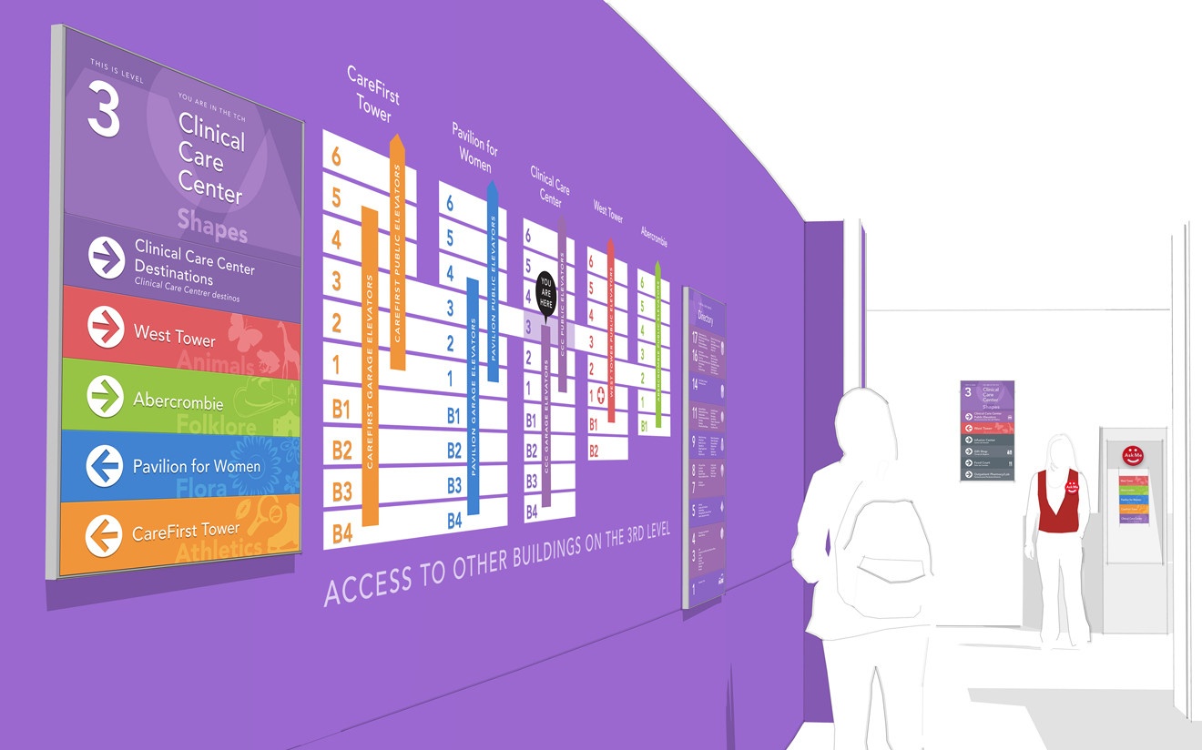
- 15+ digital touchscreens that provide maps & turn-by-turn directions to almost all hospital destinations
 |
|
Children's, naming, typography, thematic graphics and color standards inform visitors of the building and level locations at all decision points, using multiple levels of reinforcement. |
#4: Design for Flexibility & Consistency.
SC: At the time of the redesign, Seattle Children's was undergoing a one million sq. ft. expansion, and planned for a branding statement that could be adapted as necessary for the future campus.
“It’s essential to make your design flexible and logical. You want to have room to grow up and out,” Johnson said. “You also want a system that’s timeless, which means colors, typefaces, and icons that aren’t faddish.”
For a design that could “grow” with kids, and ultimately appeal to all age groups, they also went for a deliberately modern, stylistic feel “that wasn’t too cartoonish.”
TC: Texas Children’s also knows a thing or two about expansion, with a footprint that will span almost 10 million sq. ft. by 2018.
“With such rapid growth, including our most recent community hospital opening in The Woodlands, as well as a new 25-story tower in the Texas Medical Center that will be the new home for Texas Children’s Heart Center, we knew we had exciting opportunities to develop and execute new and improved, and most importantly, long-term wayfinding solutions right from the start,” said Dan Samora, director of Facilities Planning and Development at the hospital.
 |
|
Prototype showing how Texas Childrens’ existing sign chassis could be retro-fitted with improved wayfinding messaging and directionals. Image courtesy of Formation. |
#5: Solicit (tons of) Feedback.
Everyone knows that wayfinding in healthcare is supposed to be intuitive--but how can you design it when everyone’s intuition is different?
SC: The answer, Johnson said, is feedback--lots of it and early on. Seattle Children’s worked with patients, staff, and families throughout the selection process. This testing was influential on many factors, like the decision not to name an elevator “Turtle” (which could imply slowness), and preference of the word “level” over “floor.”
“This part of the process can’t be emphasized enough,” Johnson said. “The ER team’s ability to find their way through the hospital is a life-or-death situation, especially when it comes to new employees. Feedback needs to come from all sides to prevent any potential chaos.”
TC: For Texas Children’s, a pilot approach has been of great value.
“Before we roll out something, we identify an area of the facility where it can be piloted. A lot of our approach is testing, working with the Patient Experience team and patient and family focus groups then incorporating their feedback to validate our process,” said Samora.
Prior to a pilot, they put themselves in the patient’s shoes--literally.
“About two years ago, as we made a commitment to improve wayfinding, we engaged with Formation. Through the consulting process, we physically rode in the car with families and patients, and the feedback captured set the tone for the whole initiative,” added Samora. “That exercise put everything in perspective. It put us in the patient’s point of view.”
 |
|
Early rendering of a proposed sculptural mapping system at Texas Children’s, based on findings from ethnographic research. Image courtesy of Formation. |
#6: Cultural Sensitivity is a Must.
Is your design inclusive, universally understandable, and culturally acceptable? To make certain a scheme will appeal to diverse populations, it’s essential to put it through many different filters.
SC: Multilingual signage is becoming the standard, and California has even mandated multilingual care access. Johnson said the Seattle Children’s team enlisted a ton of input and translated the names to other languages to make sure they made sense. For instance, the team found that owls, which were part of the original design, are harbingers of death in Native American culture-- and therefore not a good choice.
This inclusivity extends to those with different types of color blindness; the colors meet the guidelines set forth in the ADA. Testing also revealed that it’s important for the animals and illustrations to appear both alone and in family groups, to be sensitive to different patient perspectives and situations.
#7: Make Maintenance a Priority.
SC: Johnson shared the vital importance of pre-scheduled maintenance and communication.
“Names change, locations change, and you need a system that’s easy to update almost on demand,” Johnson said. “We use a lot of applied vinyl and have regular, frequent visits with vendors so that the system stays fresh. If you don’t have that, you’ll have to resort to homemade paper signs, which is not what you want.”
TC: As the nation’s largest free-standing children’s hospital, the upkeep is an incredibly important commitment to the wayfinding investment at Texas Children’s.
As Jena Guajardo, who manages the facilities graphics program, said, “Whether it’s updating the digital directory, designing new signage or keeping the paint fresh, we don’t think of it as just another maintenance task. It’s about focusing on what will help patients and visitors.”
Join us at HealthSpaces '18 for more on innovations in healthcare facilities planning, design and construction.


.png)
-Mar-03-2026-04-36-47-9807-PM.png)

-4.png)
-Dec-09-2025-05-48-44-4379-PM.png)

Comments